Problem
The target users needed software that felt clear under pressure: fast enough for daily work, elegant enough to trust, and structured enough to evolve.
Case study
A lab workflow app that helps students document measurements, chart uncertainty, and export clean experiment reports.
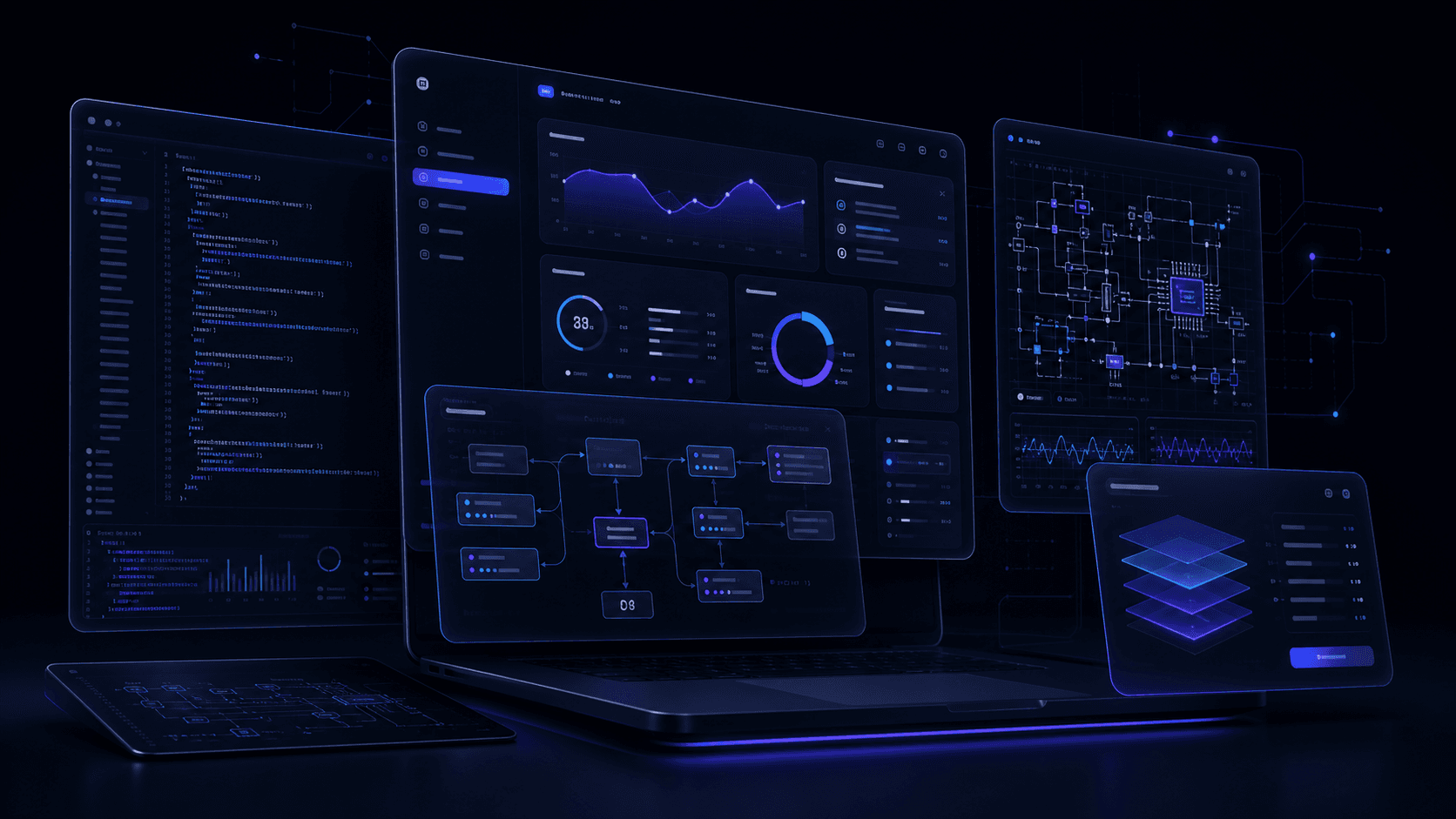
The target users needed software that felt clear under pressure: fast enough for daily work, elegant enough to trust, and structured enough to evolve.
I mapped user journeys, studied adjacent tools, and identified the screens where clarity had the highest operational value.
The build was split into discovery, information architecture, component design, API contracts, implementation, QA, and launch preparation.
Layer 1
App shell with route-level composition and reusable feature modules.
Layer 2
Typed data contracts shared between UI states and service boundaries.
Layer 3
Progressive enhancement for animations, forms, and rich previews.
The visual system uses dark surfaces, restrained color, high-contrast type, glass panels, and motion that supports orientation rather than spectacle.